
Microsoft - 3D For Everyone
Senior UX Motion & Product Designer

On Microsoft’s Every Day Magic team we crafted experiences for Microsoft's '3D for Everyone' family of products.
Remix 3D • Mobile 3D Scanning • Paint 3D • 3D for Office • Mixed Reality Viewer • Photos & Videos
3D what now?
3D For Everyone, was an effort aimed at bringing 3D to everyone — making it easy to capture, create and share in 3D. Made available for free to 400 million users with the Windows 10 Creators Update.
Why 3D?
3D can better communicate ideas and expression, it accelerates comprehension because it’s much more representative of the world in which we live.


I spearheaded the development of cohesive, user-centric experiences across a suite of products, including Microsoft Stream, Photos & Videos, and the 3D for Everyone family of products.
-
Crafted the look and feel of UI animation, interaction, and user experience for 3D for Everyone products, notably Remix 3D, 3D scanning, and Paint 3D
-
Led, managed, and mentored designers, motion, and interaction efforts across multiple products, fostering a culture of collaboration and excellence.
-
Created detailed animations to investigate proposed interaction models using tools like Principle and After Effects, driving innovation and user-centric design.
-
Developed and executed plans to reduce perceived latency in our experiences, ensuring seamless user interactions.
-
Led product features from concept to implementation, guiding the design team to deliver impactful solutions.
-
Developed, led, and maintained a motion design pipeline that integrated with existing design and engineering workflows, streamlining the design process.
-
Established and maintained organization-wide motion principles and pipeline, promoting consistency and excellence across the organization. These directly impacted the Company design motion language, and influenced Windows 10 CE features.
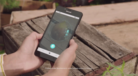
3D Scanning Demonstration
Remix3D.com

Case Study
Remix3D.com • Interactive Thumbnails

Problem
Our users are struggling to efficiently discover relevant 3D models within our vast library, resulting in a tedious and time-consuming experience. The current requirement to click into each page and wait for the model to load is leading to user frustration and disengagement. How might we design a more seamless and accessible 3D browsing experience, enabling users to quickly find the models they need without sacrificing performance?

Background & Context
Microsoft's Remix 3D was a cloud-based library of 3D objects, aiming to empower creators and developers with a vast collection of shareable and downloadable 3D content. Remix 3D was designed to support the growing demand for 3D assets in various applications, including:
Virtual and augmented reality experiences
3D modeling and design
Gaming and simulation
Education and training
The library was integrated with Microsoft's suite of creative tools, such as Paint 3D, 3D Viewer, 3D Builder, PowerPoint, Word, Excel, and Outlook, making it easy for users to access and utilize 3D objects in their projects. Additionally, users could upload and share their own 3D models, fostering a community-driven approach to 3D content creation.
With the rapid growth of the library, it became essential to address the challenge of efficiently discovering and accessing relevant 3D objects, which led to the problem statement and subsequent design solution.
It was also important that we embody the ongoing work of the Microsoft design system that became known as Fluent.

Research & Discovery
To better understand the challenges and opportunities, we conducted:
User interviews with frequent users of Remix 3D, revealing frustration with the current search functionality and a desire for more intuitive discovery methods.
Analytics analysis, which showed that users were often searching for specific objects but struggling to find them, leading to high bounce rates and low engagement.
Competitor research, highlighting the importance of visual previews, filtering, and faceted search in similar 3D libraries that also had higher loading rates.
This research led us to a discovery phase of looking for examples that embraced our design principles, while exploring possibilities

Inspiration: A few years prior, my friends at Digital Kitchen made ProtoBooth. A build that captured and made awesome rotating Gifs with one click.
Inspiration: Example of simmilar hover lifted style we wanted from Dejan Markovic on Dribble

Inspiration: From our WDG partners exploring design language

Inspiration: From our WDG partners exploring design language
Ideation & Concepting
❌ Can we develop a mini model viewer just for thumbnails?
Pros: can potentially make it to be super optimized and lightweight
Cons: Not enough eng resourcing, Large feature undertaking, not high pri
❌ Can we just play a spinning video capture in GIF form on hover?
Pros: will show model from all sides
Cons: Heavy resource ask, file size too big
✅ Can we make the thumbnails more interactive only showing one specific view at a time?
Pros: More intuitive and interactive for user, limiting the angles will help reduce file size
Cons: May make it hard to focus, and may trigger all cards when moving cursor
Risks: Need to check to make sure it’s feasible to take and host multiple images of models in catalog, and newly added models upon upload. Can we mitigate size with sprite sheets?
After multiple brainstorms, we decided on a path forward that seemed most feasible, but we needed to test in code. We needed to determine how many photos were needed and how many degrees of rotation each one should be. I gave our engineer a list of options that were different combinations of degrees of rotation. He laid them all out allowing out team members to see them all in action on one page and vote on what felt the best.
Design Language explorations: Interactive cards was the perfect opportunity to add in our desire for component lift on hover with drop shadows to adhere wit company design system Fluent

I workshopped and explored many lo-fi ideas with the team

Design Idea we went forward with to determine technical feasibility.
Solution & Design
Ultimatly we landed on the design shown below. We determined that the sweet spot for number of frames to degrees was 5 photos mapped to every 10 degrees through internal testing. This felt smooth enough to appear live, but also didn’t kill performance constraints.
The final hurdles to clear was determining how to gather 5 photos from every model in the catalog, in addition to incorporating as part of the upload flow automatically. Which we were able to figure out with our servicing team.

Motion Study showcasing final solution
Implementation & Testing
Once implemented and live, we immediately started hearing positive feedback internally and from users.
One late stage problem arose with the desire to have the cards rise on hover. With how the site was built we hit technical limitations. It would have added months of more time with potential negligible results which we couldn’t afford. We mitigated a solution with developers to still keep the drop shadow on hover to embody the spirit of what we were trying to achieve.

Final result and implementation in code
Results & Impact
The data spoke for itself. User engagement increased by 60%, and increased retention time.
The feature scaled to animated models that were added later to the catelog, allowing users to preview movements on hover.

The feature scaled to animated models that were added later, allowing users to preview movements.